Building Forms
This guide walks you through creating forms in NetPad's visual form builder.
Creating a New Form
-
Navigate to Form Builder:
- Click "New Form" from the dashboard, or
- Navigate to
/builder
-
Name Your Form:
- Enter a descriptive name
- Add an optional description
-
Connect to MongoDB:
- Enter a connection string, OR
- Select from saved connections in the vault, OR
- Use auto-provisioned Atlas cluster
- Select target database and collection
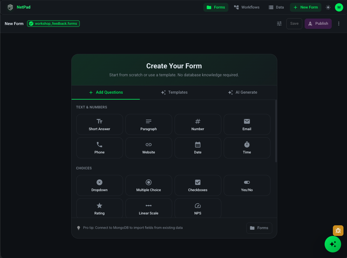
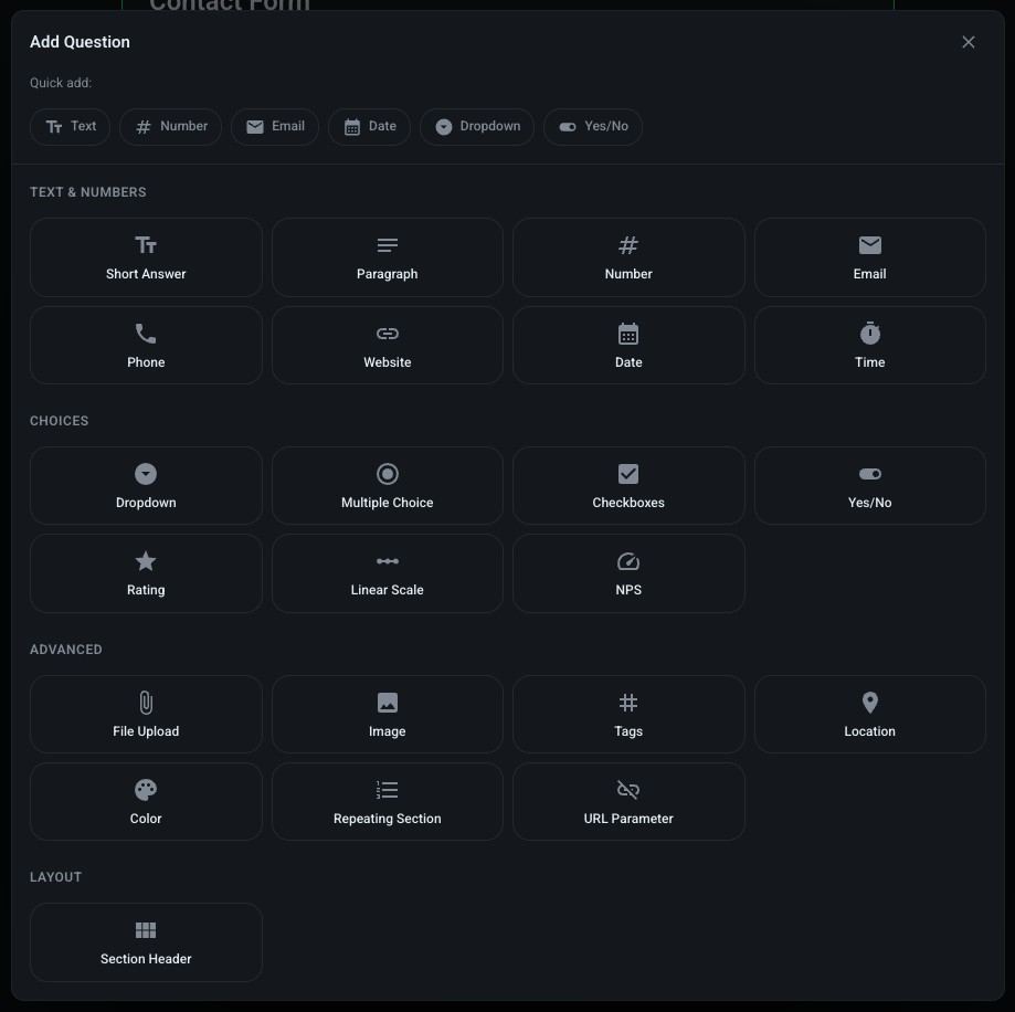
Adding Fields
Method 1: Drag and Drop
-
Open Field Palette:
- Fields are listed in the left sidebar
- Organized by category (Text, Numbers, Choices, etc.)
-
Add a Field:
- Drag a field type from the sidebar
- Drop it onto the form canvas
- Field appears in the form
-
Configure Field:
- Click the field to open properties panel
- Set field name, label, placeholder
- Configure validation rules
- Set default values
Method 2: Import from Schema
-
Click "Import from Collection":
- Available after connecting to MongoDB
-
Select Collection:
- Choose a collection from your database
- NetPad analyzes the schema
-
Review Generated Fields:
- Fields are created based on collection structure
- You can edit, remove, or add fields
-
Map Field Types:
- NetPad maps MongoDB types to form fields
- Review and adjust mappings as needed
Organizing Your Form
Single Page Forms
Simple forms can fit on one page:
- Add all fields to the main canvas
- Use sections to group related fields
- Add page breaks if needed
Multi-Page Forms
For longer forms, use multiple pages:
-
Add a Page Break:
- Drag "Page Break" from layout fields
- Or click "Add Page" button
-
Configure Pages:
- Name each page
- Set page descriptions
- Enable progress indicator
-
Navigation:
- Users can navigate between pages
- Previous/Next buttons automatically added
- Progress bar shows completion status
Sections and Dividers
Organize fields with sections:
-
Add Section Divider:
- Drag "Section" from layout fields
- Add a title and description
-
Group Related Fields:
- Place related fields within sections
- Improves form organization and UX
Field Configuration
Basic Properties
Every field has these properties:
- Field ID: Unique identifier (auto-generated)
- Label: Display name for the field
- Placeholder: Hint text shown in empty fields
- Help Text: Additional guidance for users
- Required: Whether field must be filled
Field-Specific Settings
Each field type has unique settings:
- Text Fields: Min/max length, pattern validation
- Number Fields: Min/max values, decimal places
- Choice Fields: Options list, single vs. multiple selection
- Date Fields: Date format, min/max dates
- File Fields: File types, max file size, multiple files
See Field Types for detailed configuration options.
Form Settings
Access form settings from the top toolbar:
General Settings
- Form Name: Display name
- Description: Form description (shown to users)
- Thank You Message: Message after submission
- Redirect URL: Where to redirect after submission
Access Control
- Public: Anyone with URL can submit
- Authenticated: Users must sign in
- Restricted: Domain or user whitelist
Appearance
- Theme: Choose color scheme
- Custom CSS: Add custom styles (advanced)
- Logo: Upload organization logo
- Background: Set background color or image
Advanced Settings
- Bot Protection: Enable Turnstile CAPTCHA
- Webhooks: Configure webhook URLs
- URL Pre-fill: Enable query parameter pre-filling
- Submission Limit: Max submissions per user/IP
Testing Your Form
Preview Mode
-
Click "Preview":
- See form as users will see it
- Test all fields and validation
- Check conditional logic
-
Test Submission:
- Fill out the form
- Submit test data
- Verify data appears in MongoDB
Validation Testing
- Test required fields
- Test min/max constraints
- Test pattern matching
- Test conditional logic
- Verify error messages
Saving Your Form
Auto-Save
NetPad automatically saves your work:
- Drafts saved every few seconds
- Never lose your progress
- Resume editing anytime
Manual Save
- Click "Save" to force save
- Or use keyboard shortcut (Cmd/Ctrl + S)
Publishing Your Form
When ready to go live:
-
Review Form:
- Test all fields
- Verify validation
- Check conditional logic
-
Click "Publish":
- Form becomes live
- Get shareable URL
- Form accessible to users
-
Share Your Form:
- Copy the URL
- Share via email, social media, or embed
- Generate embed code for websites
See Publishing for more details.
Best Practices
Form Design
- Keep it Simple: Don't overwhelm users
- Logical Order: Group related fields
- Clear Labels: Use descriptive field names
- Help Text: Guide users when needed
- Progress Indicators: Show progress for long forms
Validation
- Validate Early: Use real-time validation
- Clear Errors: Provide helpful error messages
- Required Fields: Mark clearly with asterisks
- Pattern Validation: Use regex for complex rules
Performance
- Limit Fields: Keep forms under 50 fields when possible
- Use Multi-Page: Break large forms into steps
- Optimize Images: Compress file uploads
- Test Performance: Check load times
Next Steps
- Field Types - Learn about all field types
- Validation - Set up validation rules
- Conditional Logic - Add dynamic behavior
- Publishing - Make your form live